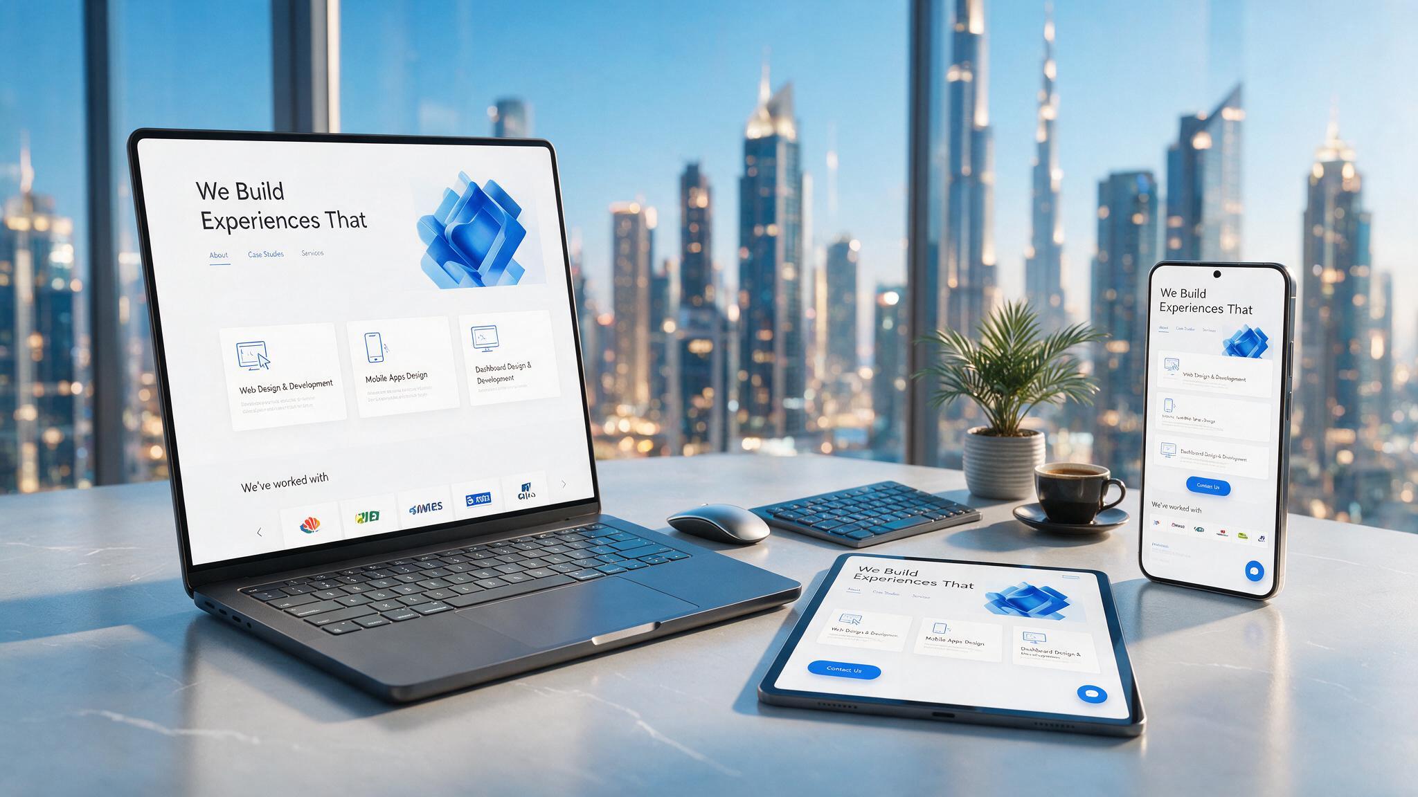
A responsive website works on every screen width your customers use, and the test is not the homepage. Builds break on filtered catalogues, multi-step forms, admin panels and Arabic layouts, so those are the screens to check before you sign off.
Every Dubai agency says its websites are "responsive". Few can tell you what that means, or show you where their last build broke. We have rebuilt enough half-responsive sites to know which screens get skipped, and we close those gaps before launch rather than after a client complains.
Where do responsive builds break?

The homepage is almost never the problem. It is simple enough that most agencies get it right, even by accident. The failures cluster in the screens nobody stress-tests before handover:
- Filtered product catalogues. Once you add sort options, category filters and pagination, the number of layout states multiplies. Filter chips wrap into the product grid, "showing 1-24 of 340" collides with the sort dropdown, and nobody notices because nobody tested with filters applied.
- Booking and multi-step forms. Step one, pick a date, usually works. Step three, where payment details and file uploads live, is where agencies stop testing. It is also the step your customer is most likely to abandon if it breaks.
- Admin and back-office panels. If your build includes "an area where I can manage stock and process orders", ask whether that panel was built responsive too. It is the piece most often left desktop-only, and the piece you will use from your phone between meetings.
- Arabic and RTL layouts. A site that flips direction for Arabic needs a second layout, not a translated copy of the English one. Treating RTL as a CSS toggle ships broken spacing, misaligned icons and forms that read the wrong way. Why Arabic is a second layout goes into detail.
- Checkout with UAE payment methods. Telr, PayTabs, Tabby and Tamara each render their own widget, and each needs checking on a real phone rather than assuming it inherits the surrounding layout.
That is why the same brief gets quoted so differently. "Responsive layout that works on desktop and mobile" sounds like one line item. In practice it is five or six separate things that were either built and tested, or assumed and skipped. For stores specifically, what makes a mobile friendly ecommerce website covers the checkout side.
What should a responsive build include?
Every build we ship is tested against the screens above before it goes live.
| What often happens | What we do |
|---|---|
| Resize a browser window and call it tested | Test on real devices at real breakpoints: 360px, 768px, 1024px |
| Make the homepage responsive, leave the admin panel desktop-only | Hold admin panels and dashboards to the same standard as public pages |
| Bolt Arabic on as a mirrored stylesheet | Design RTL as its own layout pass |
| Quote a vague "responsive design" line item | Scope every template and breakpoint in writing before work starts |
| Outsource the build to a subcontractor | The same team in Dubai Media City designs, builds and tests your site |
You also keep full ownership of the code and hosting from day one, so there is no lock-in and no "come back to us to make a change".
How does the process run?
- Scope: we list every page template and breakpoint that needs testing, in writing, so the quote has no ambiguity.
- Design: layouts built for the smallest screen first, then scaled up.
- Build: custom code, not a bought theme with the colours swapped.
- Device testing: every listed template checked on real phones and tablets, including admin views if they are in scope.
- Launch: a fixed timeline, with a warranty period included.
Who is this for?
- Ecommerce and catalogue sites that need product grids, filters and search to hold up on mobile, whether checkout is live now or coming later.
- Booking and appointment platforms, where a broken step-three form costs you a customer.
- Professional services firms that need one fast, polished, mobile-correct site more than a sprawling one.
- Existing WordPress or Shopify sites where "improve mobile responsiveness" is the real brief, not a full rebuild.
How we build these is set out on our web development page, and the website cost guide shows what drives the price. For more on where poor mobile layouts cost UAE businesses leads, see GoDesign's breakdown of mobile conversion failures.
Frequently asked questions
What does responsive website design actually mean?
A site that adapts correctly across the screen widths people actually use, from small phones and tablets to small laptops and large desktop monitors, not just the one device someone happened to check it on.
How long does a responsive rebuild take in Dubai?
It depends on the number of unique templates and whether admin panels or payment integrations are in scope. A focused business site is typically 2 to 6 weeks. You get a fixed timeline as part of the quote, before any work starts.
Is responsive design different from building a mobile app?
Yes. A responsive website is one codebase that adapts to any screen through the browser. A mobile app is a separate, installed product. Most businesses need a responsive site first, and an app is a second step if it is needed at all.
Can you fix an existing site instead of rebuilding it?
Often, yes. If the underlying structure is sound, we can target the specific broken screens, such as catalogue pages, booking forms or admin views, instead of starting over.
Get a fixed quote in one business day
Tell us what you are building (a catalogue site, a booking platform, a rebuild of an existing WordPress or Shopify site) and we will scope which templates and breakpoints need covering, then send a fixed quote within one business day. Send your brief or email scale@godesign.ae.