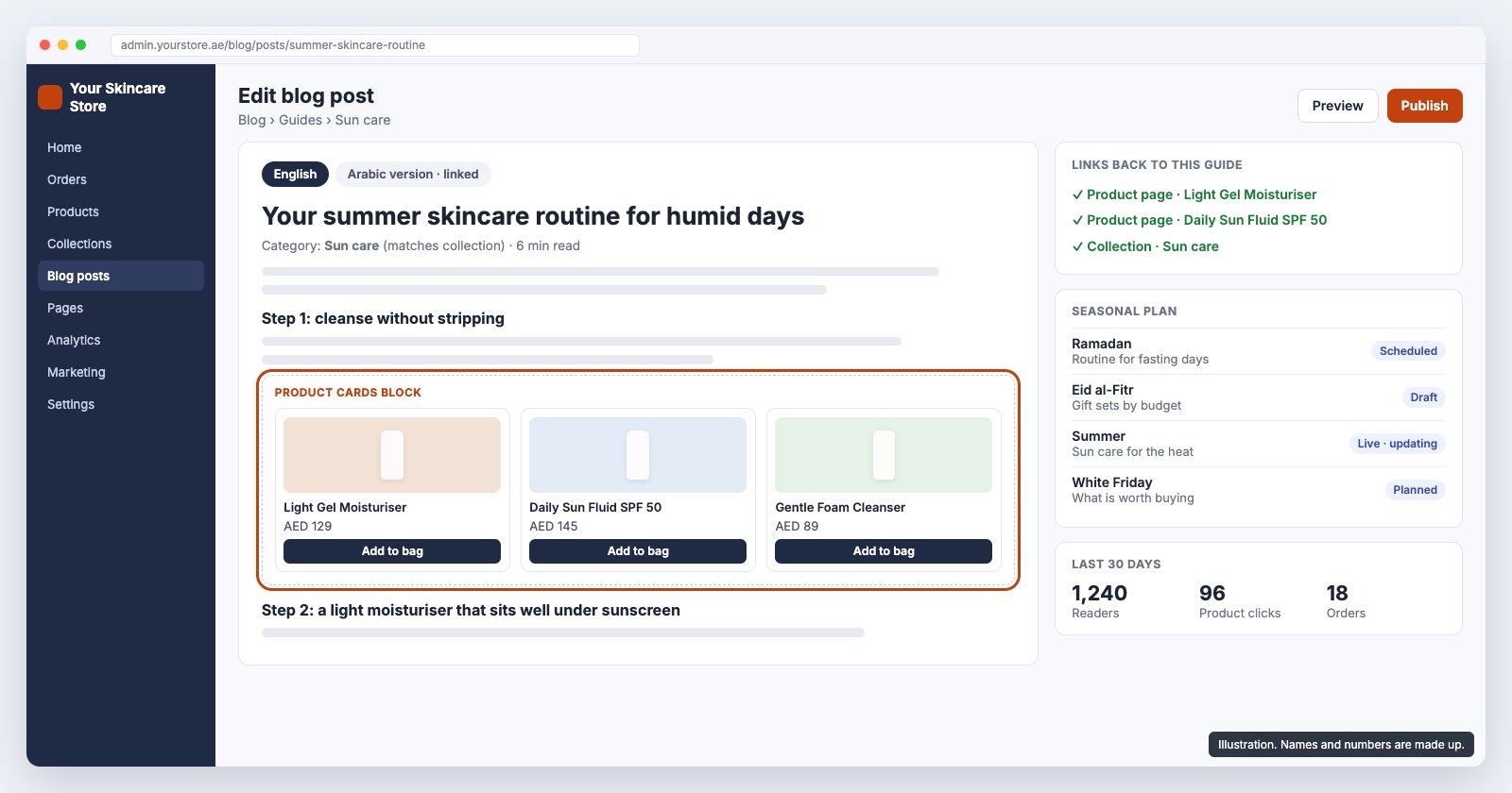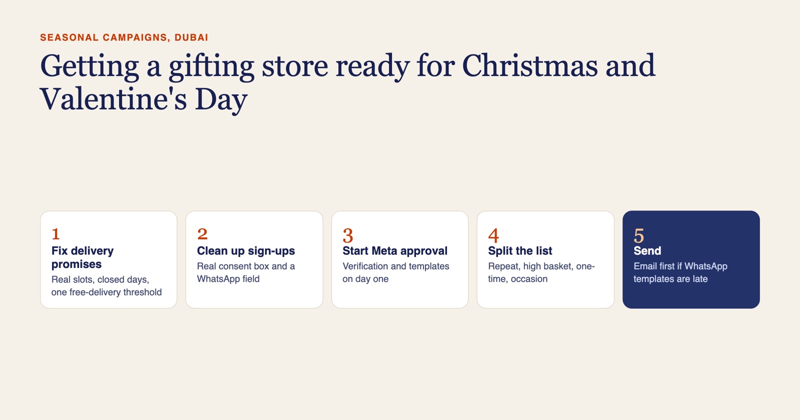
Ecommerce UX design for a Dubai online store decides what a shopper sees, in what order, and how many steps stand between a product and a paid order. Get the menu, product page and checkout right first. Then make sure the size, delivery, returns and payment questions are answered next to the price, the checkout suits UAE addresses, the Arabic layout is designed rather than flipped, and trust signals sit where the doubt appears.
This piece is written for fashion and accessories stores, where size, fit and returns make the product page do the most work. For the wider UX and UI process, from research to design systems and developer handoff, see GoDesign's guide to UX/UI design services in Dubai. Phone-specific fixes are covered in what has to work on a mobile ecommerce store.
What is ecommerce UX design, and what does it change?
Ecommerce UX design sets the order of things on a store and the effort each step takes. A shopper decides in seconds whether a store is worth the trouble, and most of that decision rests on structure: can I find my size, do I believe the delivery date, how many fields stand between me and paying?
Store owners usually ask us for a redesign because sales feel low, and the brief often starts with colours and a new homepage. The losses usually sit elsewhere. A menu that lists every category at once, a product page that hides the reason to buy in a tab, a checkout that asks for a postcode the UAE does not use. Those are UX problems, and a new colour scheme will not fix them.
We work in this order:
- Walk the store as a customer. On a phone and a desktop, in English and Arabic, from an ad and from search, through to a test order.
- Read the funnel. Product views, add-to-cart, checkout started and purchases in GA4, to see where people drop.
- Wireframe the templates that sell. Menu, catalogue, product page, cart and checkout, before any styling.
- Prototype and test. A clickable Figma prototype, walked through by real shoppers.
- Design the UI and hand over. Type, colour and components on top of the agreed structure, then the build.
How should navigation and filters work when a store has hundreds of products?
Keep the top level short and let the filters do the rest. A fashion store with a dozen departments and a long list of sub-categories cannot show them all in one menu without overwhelming people. Group them into a few main departments, give each one a menu panel with images of the main categories, and push the detail into filters.
Filters should match how your customers shop, not how your supplier feed is arranged. For fashion that usually means size, colour, fit, occasion and price. A filter that hides the products when it opens on a phone, or cannot be cleared in one tap, loses people fast.
When we rebuilt Frankfurter Kaffeerösterei, a WooCommerce coffee store, we wrote the product filtering for the way people choose coffee instead of using a stock plugin. A fashion store needs the same thinking with different filters.
Search needs the same care. It should handle misspellings and return products for English and Arabic names alike.
What should product page design include to sell in Dubai?
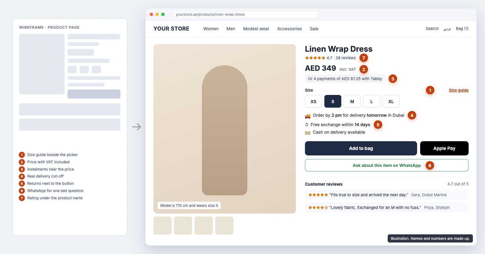
Answers next to the price. The shopper's questions arrive in a predictable order, and the page should answer them in that order, before the fold where possible:
- Photos that show the fit. On-model shots from more than one angle, and the model's size stated.
- Price with VAT included. UAE shoppers expect to see the final price, and VAT rules require it for prices shown to consumers.
- Size picker with the size guide beside it. Not in the footer and not as a PDF.
- Delivery promise. The real cut-off time and delivery days for the shopper's emirate, matching what checkout offers.
- Returns in one line. "Free exchange within 14 days", or whatever your real policy is, written next to the button.
- Instalments and wallets. Tabby or Tamara messaging and Apple Pay shown near the price.
- A way to ask. A WhatsApp button for the shopper who has one question before buying.
Below that sit the details: fabric, care, fit notes and reviews. Reviews belong on the product page, with photos where customers add them, not on a separate testimonials page nobody visits.
"Excellent job building my Shopify dropshipping store. The design is sleek, user-friendly, and optimised for 70 products. Communication was smooth, and all my questions were promptly answered."
El Mustapha E., via Freelancer
Is your store getting visits but not orders? Send us the store link and your top three products. We will walk the path from product page to payment as a customer would and reply within one business day with what we would change first and a fixed quote. Request a store review.
Which trust signals do UAE shoppers look for?
The ones that answer "will I get it, and can I get my money back?" Place each one where that doubt appears, not in a row of badges in the footer.
| Signal | Where it belongs |
|---|---|
| Delivery days by emirate | Product page and cart |
| Returns and exchange policy | Product page, next to the add-to-bag button |
| Cash on delivery, with any fee | Product page and the first checkout step |
| Familiar payment options (cards, Apple Pay, Tabby, Tamara) | Near the price and in checkout |
| A UAE phone number and WhatsApp | Header, product page and order confirmation |
| Real reviews | On each product page |
A checkout that stays on your own domain, with your branding, also matters. A shopper who is suddenly sent to an unfamiliar page to pay often stops there.
What are the checkout UX best practices for a UAE store?
Keep it short enough to finish with one thumb, on one page where the platform allows it.
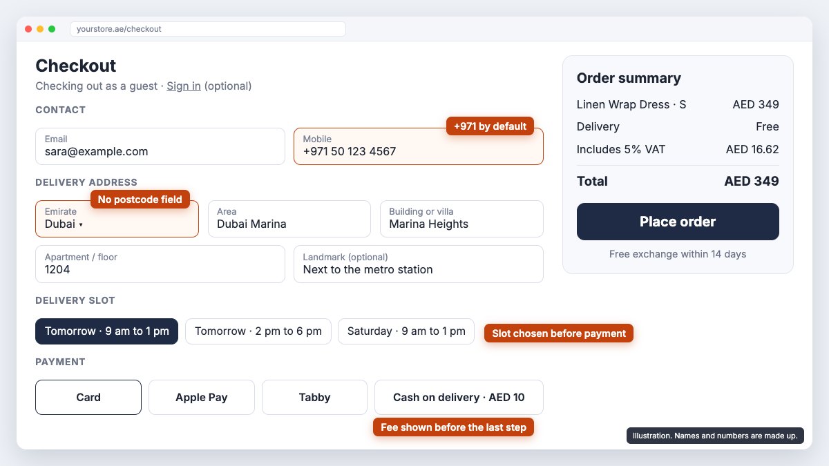
The parts that are specific to the UAE:
- An address form built for UAE addresses. Emirate, area, building or villa, apartment number and a landmark field. No postcode field, or at least not a required one.
- A phone field that starts with +971 and accepts local formats, because the courier will call that number.
- Guest checkout. Account creation after the order, not before it.
- The delivery slot before payment, so nobody pays and then finds the date does not work.
- Cash on delivery stated early, with any fee shown before the last step.
Phone-specific checkout fixes, such as keyboards and wallet payments, are in our mobile ecommerce guide.
Is page speed part of ecommerce UX?
Yes. A shopper does not separate a slow page from a badly designed one; both feel like effort. On a store, speed is mostly decided by what loads on every page: app and plugin scripts, product images uploaded at camera resolution, web fonts and tracking tags added over the years. Every extra one is paid for again on each product and category page, and most heavily on a phone.
That makes speed a design decision as much as a hosting one. Plan the templates with the shortest app list that does the job. On Shopify, the fix is often doing in theme code what an app does now.
What changes when the store is also in Arabic?
The whole layout reads right to left, and that is a design job, not a translation job. Menus, filter panels, product galleries, size charts and checkout fields all mirror. Arrows and progress steps flip. Some things should not mirror: product photos, logos and phone numbers.
Arabic text also runs at a different length and needs an Arabic typeface chosen for it, so buttons and labels designed for English often break. We design both languages in the same Figma file and test both before launch. Our piece on why Arabic is a second layout goes into the detail.
How do you measure whether a UX redesign works?
Measure the same funnel before and after. Product views, add-to-cart, checkout started and purchases in GA4 show which step improved and which did not. Before launch, test orders on real devices and a few shoppers walking through the prototype catch most problems while they are still cheap to fix.
For Raena Beauty, a beauty brand launching to a young audience that arrives on phones, we designed the storefront mobile first and built the sign-up funnel into the store. It carried more than 4,000 product sign-ups at launch without going down.
"I recently worked with this design company and was thoroughly impressed with their level of expertise and creativity. Their attention to detail and commitment to delivering high-quality work is unparalleled."
Hajra, via Google
How much does ecommerce UX design cost in Dubai?
Redesigning an existing store is quoted after a review, because it depends on how many templates change and whether there is an Arabic version. For a new store, design is part of our ecommerce packages: the Starter Store is AED 4,500 (USD 1,225) and the Growth Store, with a custom-coded theme and Arabic storefront, is AED 7,900 (USD 2,150).
Frequently asked questions
What is the difference between UX and UI design for an online store?
UX design decides the structure: what sits on each page, in what order, and how a shopper gets from a product to a paid order. UI design is how that structure looks: type, colour, spacing, buttons and photography. We design the UX first in wireframes, then the UI on top, so the look never hides the path to checkout.
Can you do a UX audit of my store without rebuilding it?
Often, yes. We review the store first and redesign the templates that lose sales, usually the product page, cart and checkout, inside your current Shopify or WooCommerce theme. If the theme cannot carry the changes, we tell you in writing before any work starts.
Do you design in Figma before building?
Yes. We wireframe the key templates, turn them into a clickable prototype in Figma, and walk real shoppers through it before a line of code is written. Changes are cheap at that stage and expensive after launch.
How long does an ecommerce UX redesign take?
It depends on how many templates change and whether there is an Arabic version. You get a written timeline with the quote. For new stores, our Starter Store takes 3 to 4 weeks and the Growth Store, with a custom-coded theme and Arabic storefront, takes 6 to 8 weeks.
Does the Arabic version of the store need its own design?
Yes. A right-to-left store is a second layout, not a flipped copy. Menus, filters, size charts, product galleries and checkout fields all need checking in Arabic, and we design and test both languages before launch.
Get your store's UX reviewed
Tell us which platform the store runs on, what you sell and where you think shoppers drop off. We reply within one business day with scope, a timeline and a fixed price in AED. See our Shopify development service, send us a brief, or message us on WhatsApp.